Moho
brand identity and applicatin
brand identity and applicatin
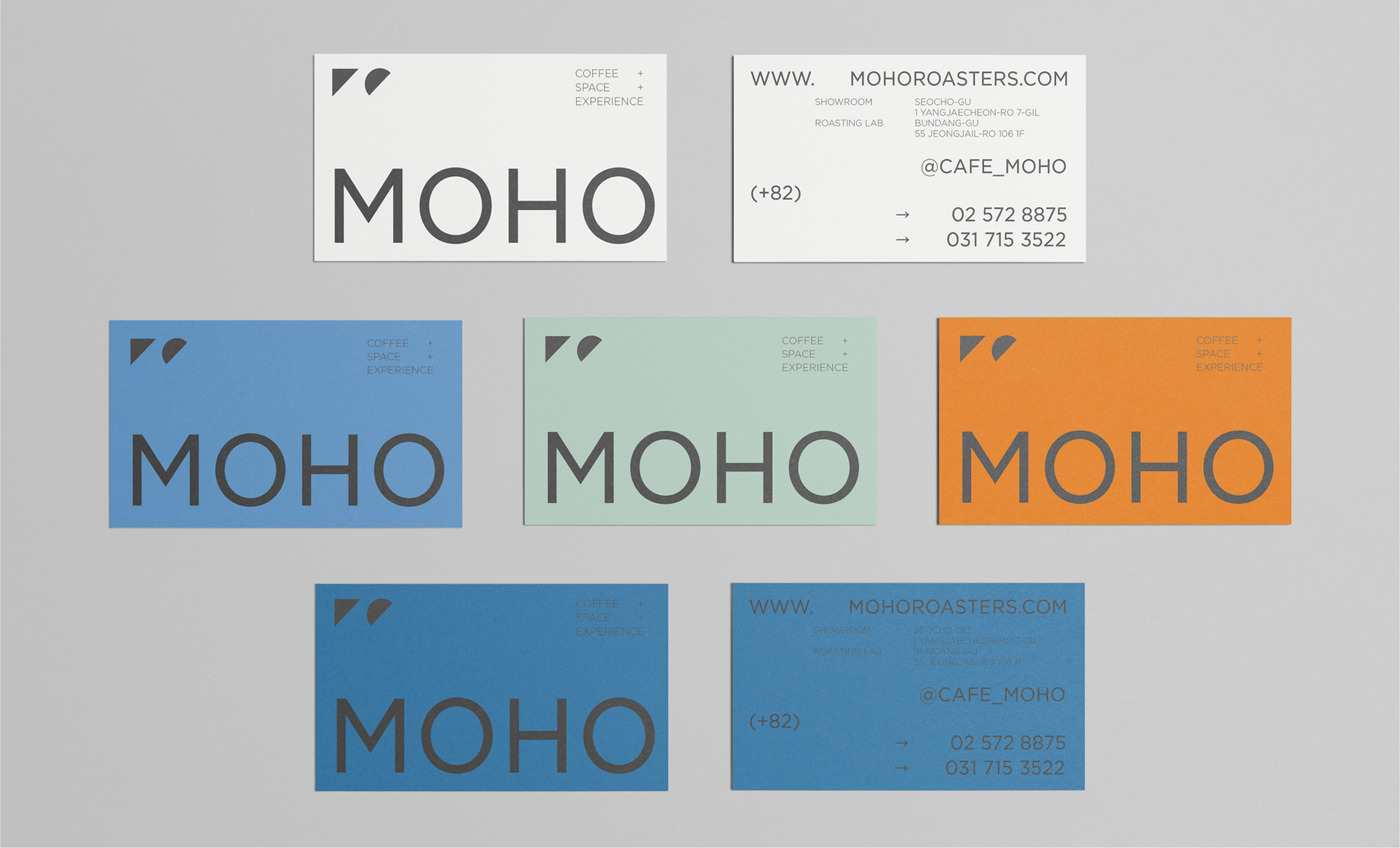
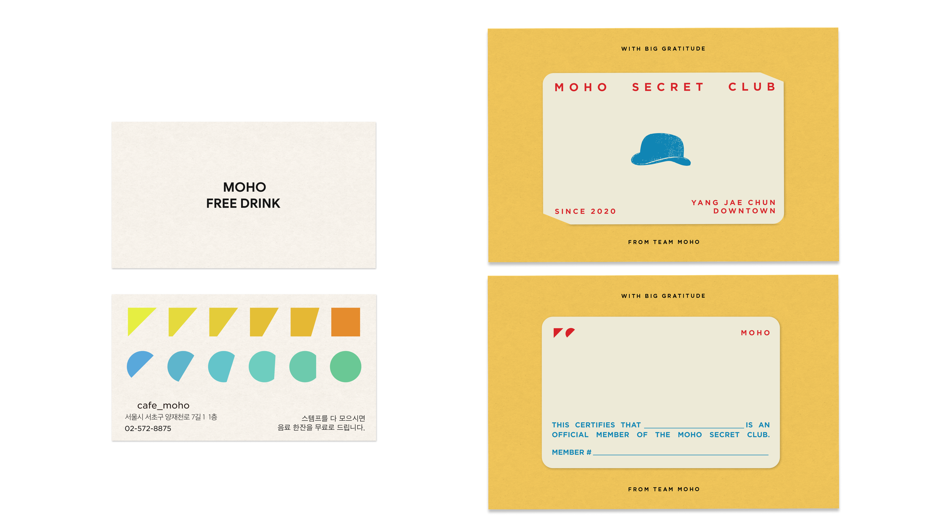
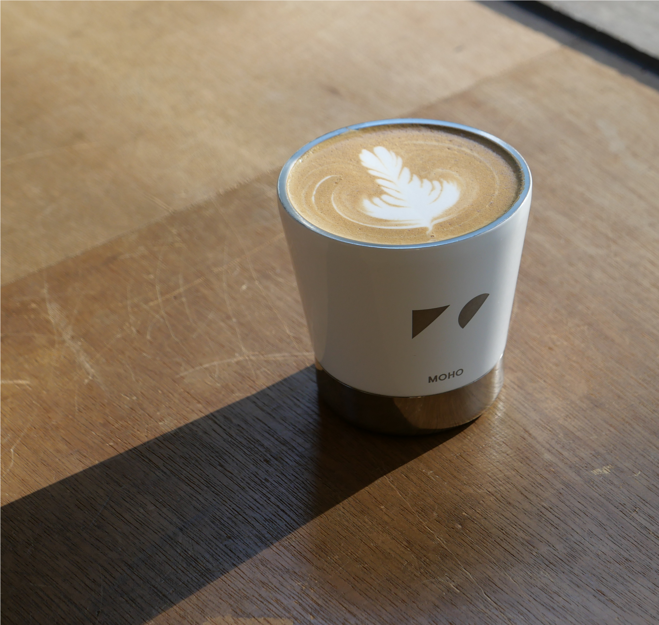
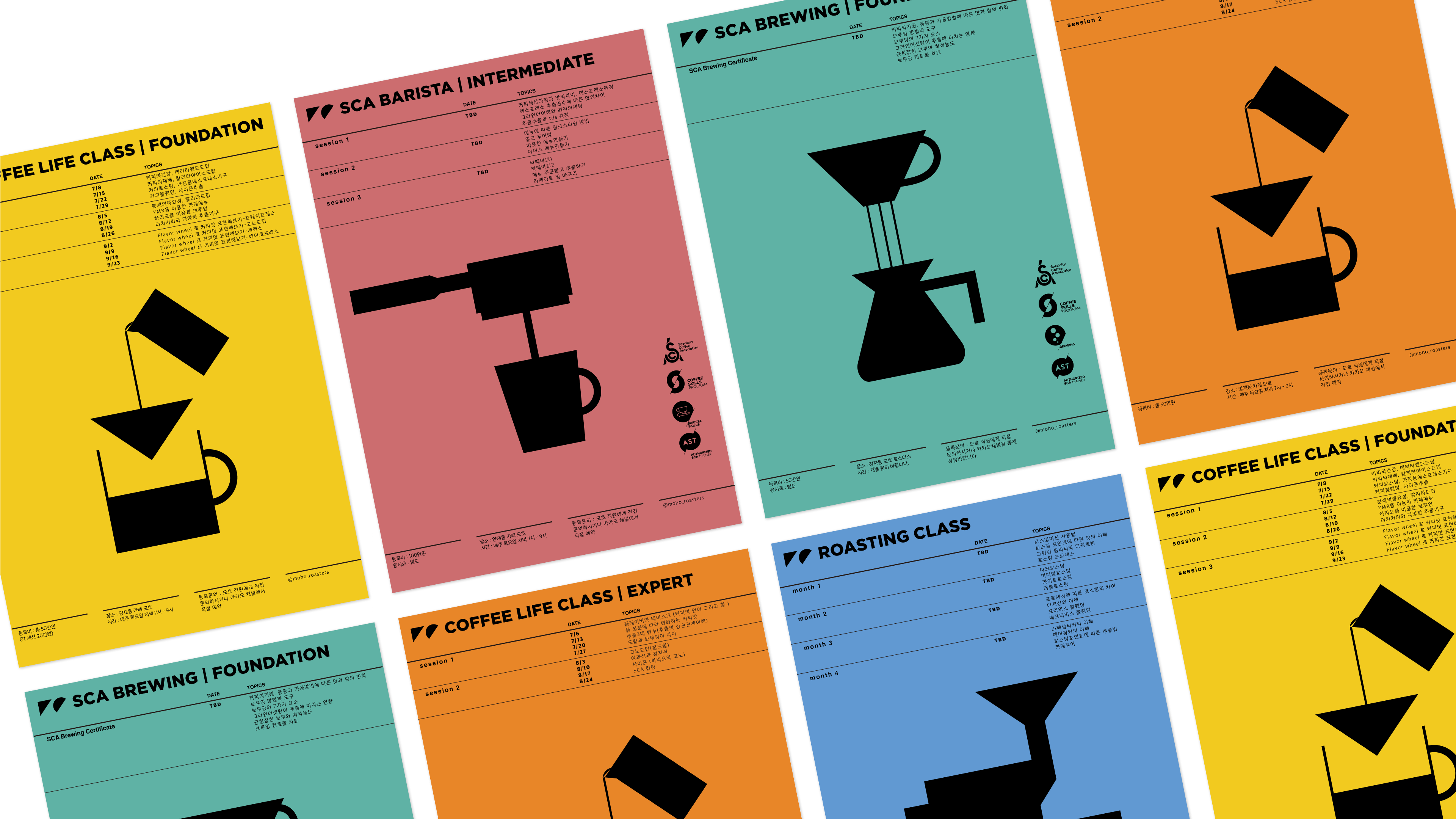
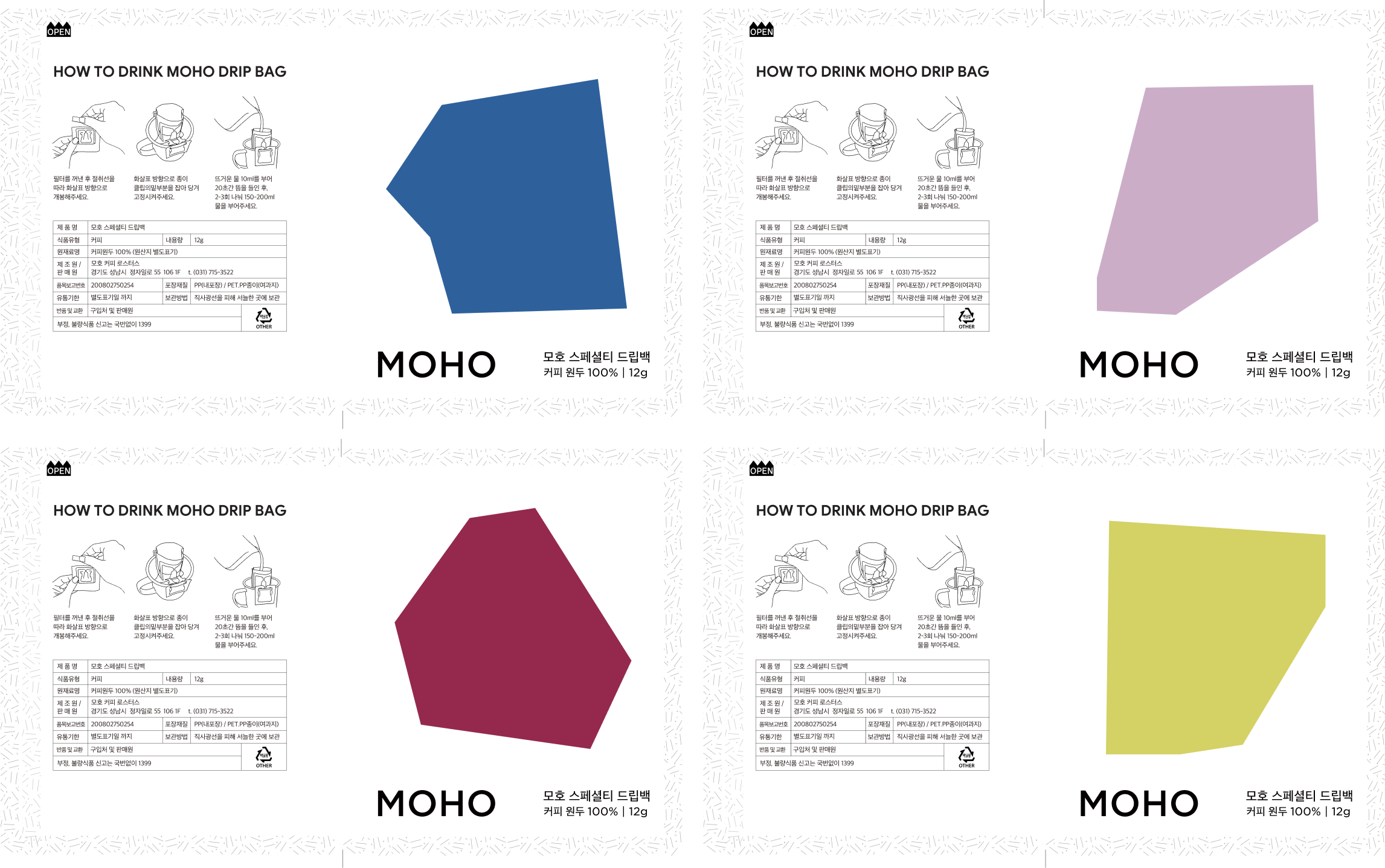
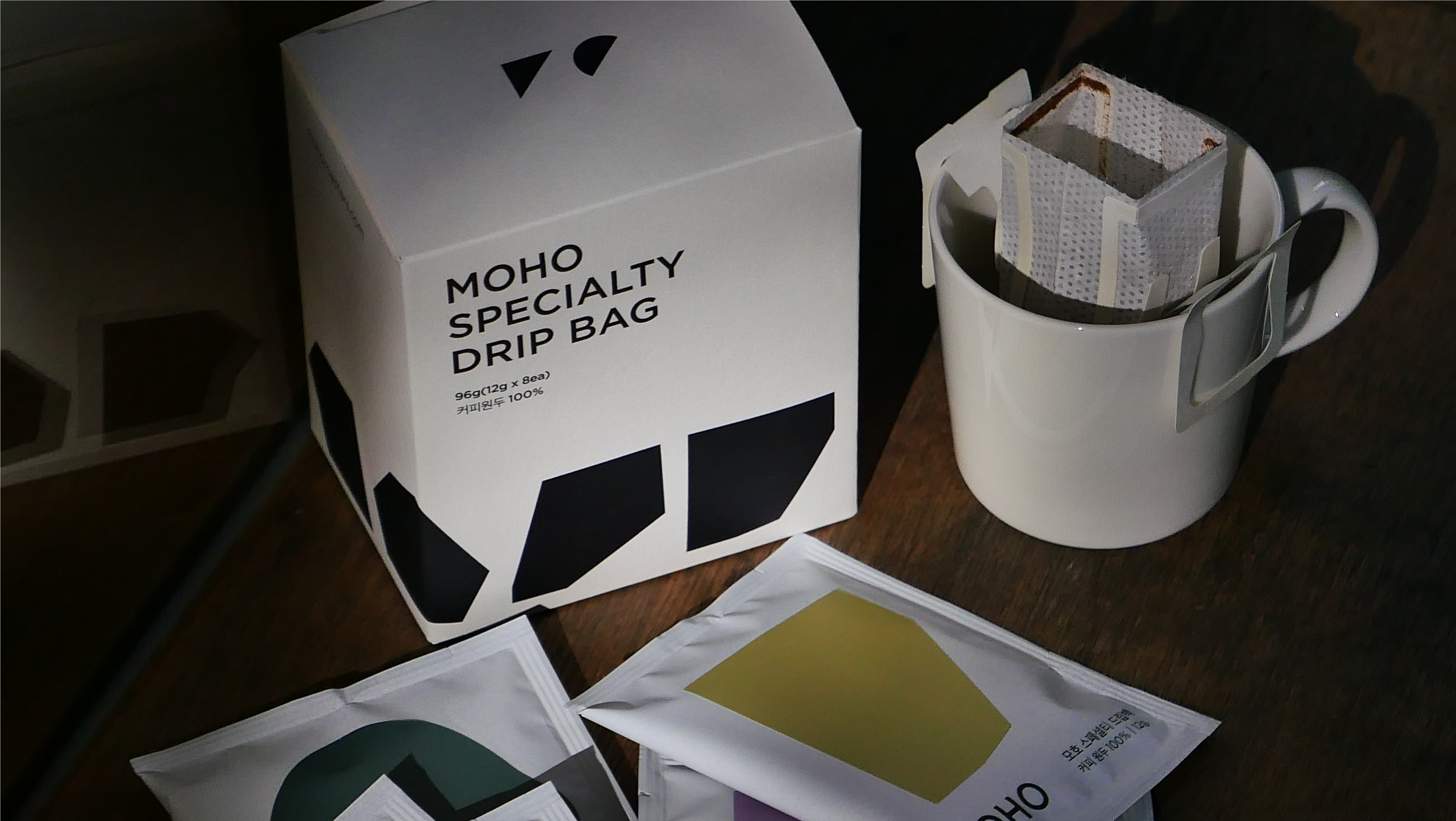
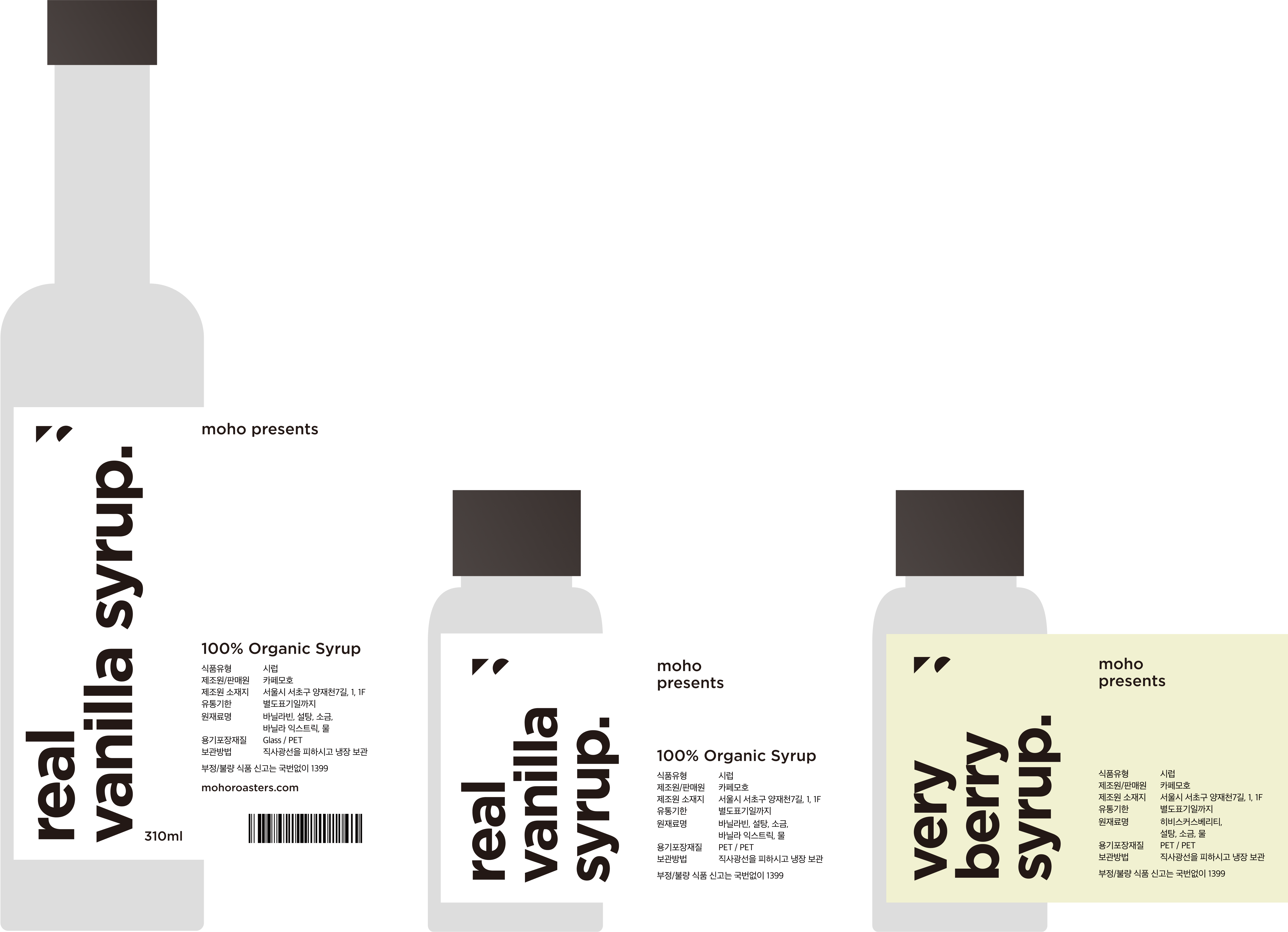
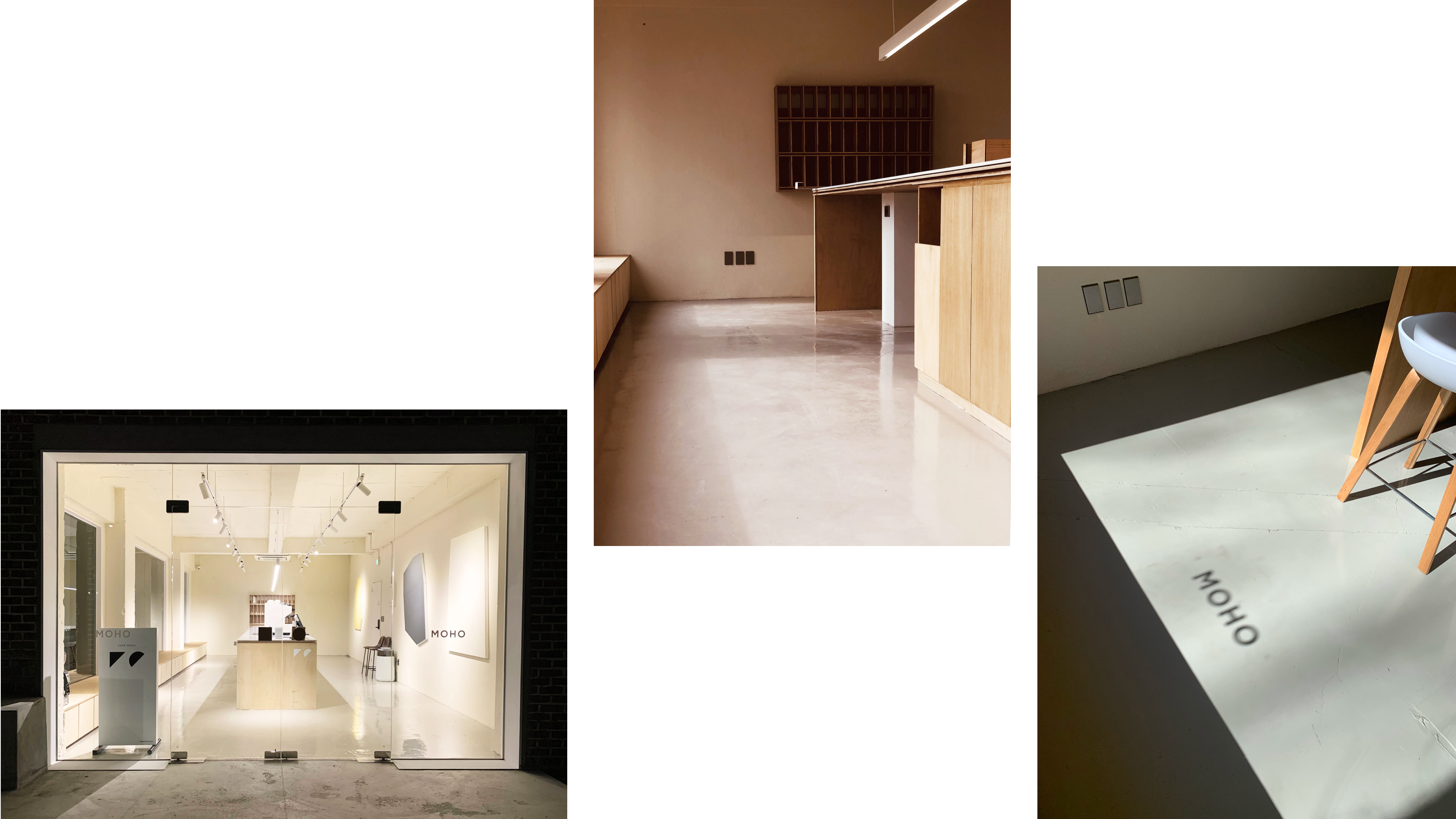
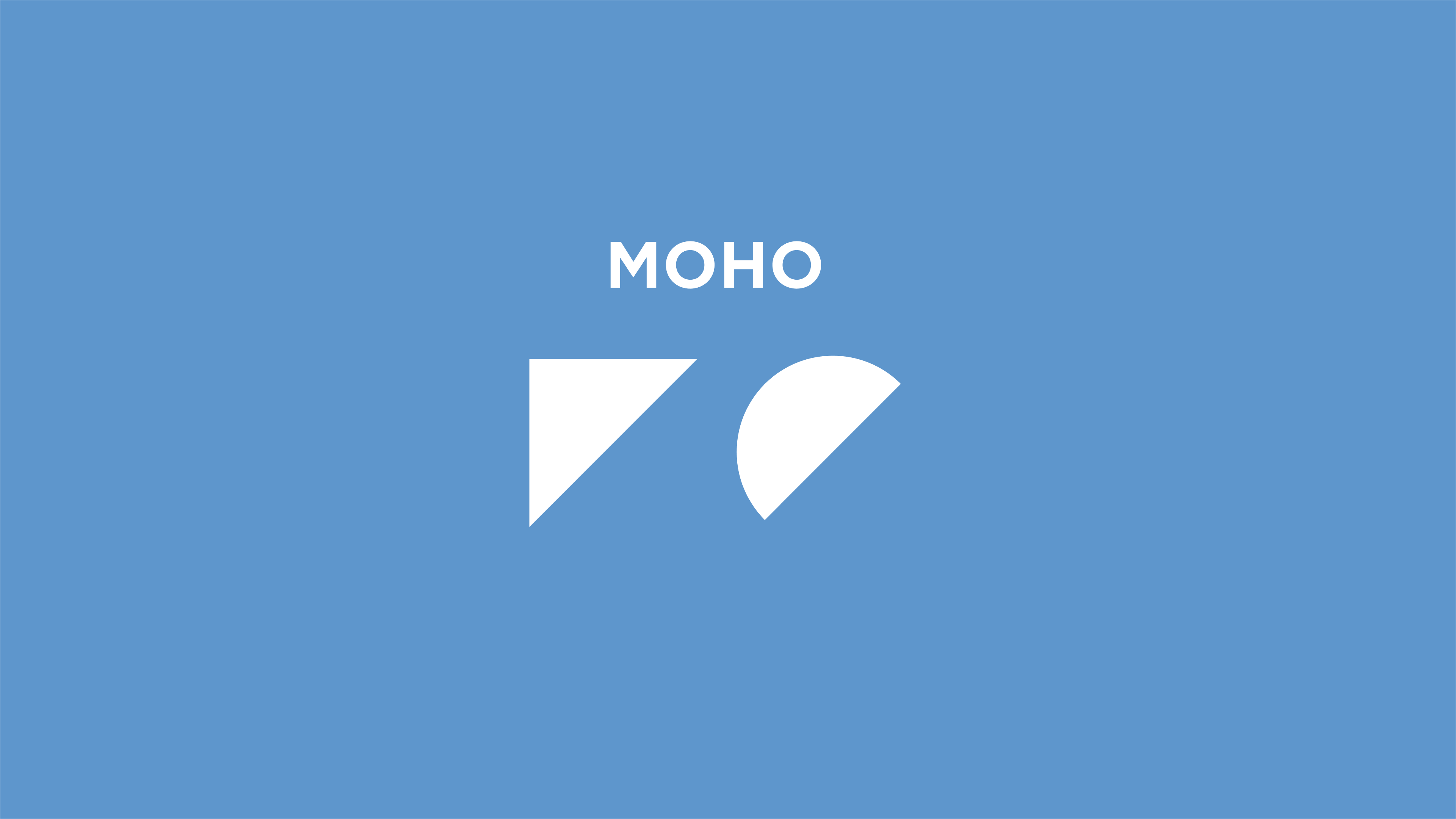
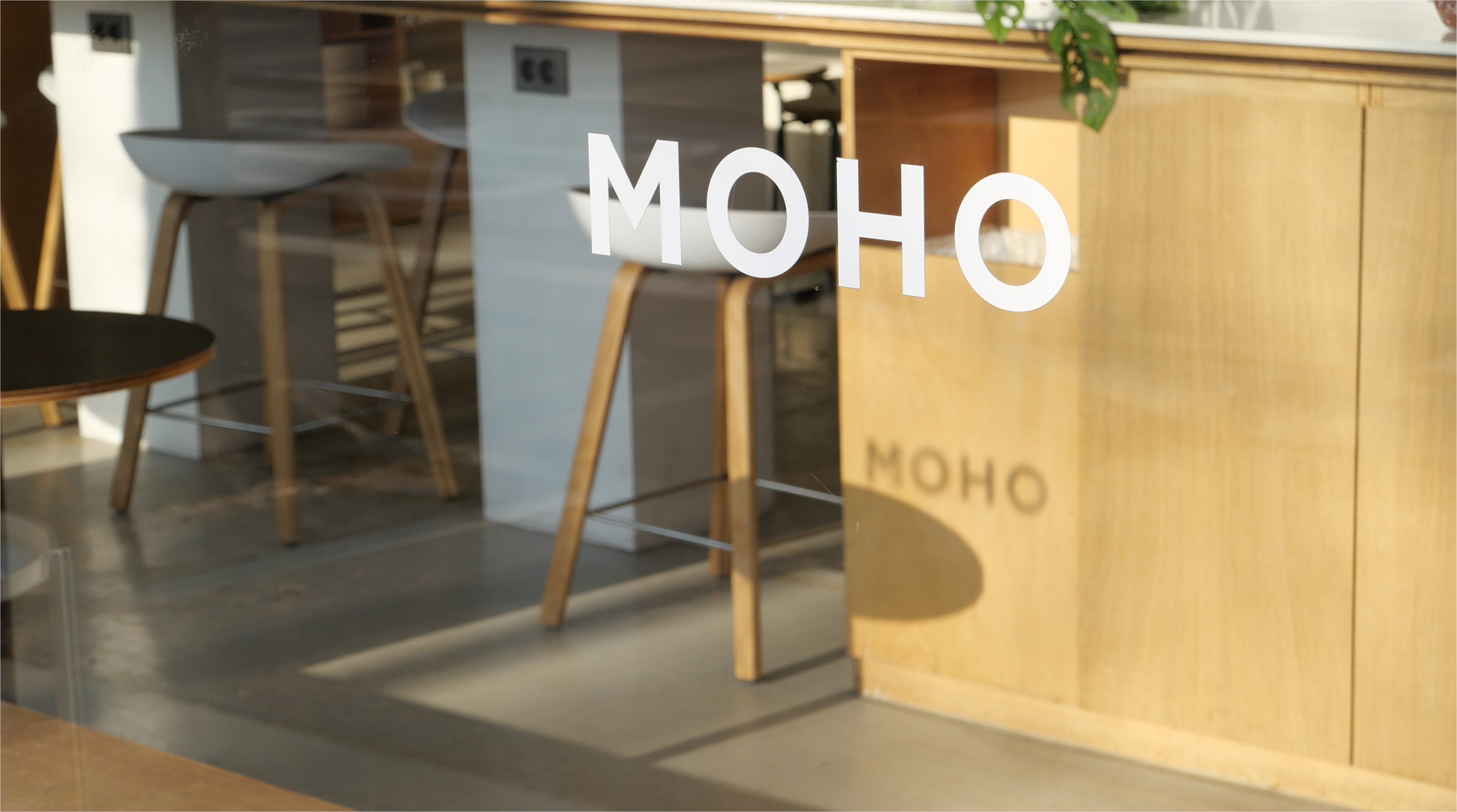
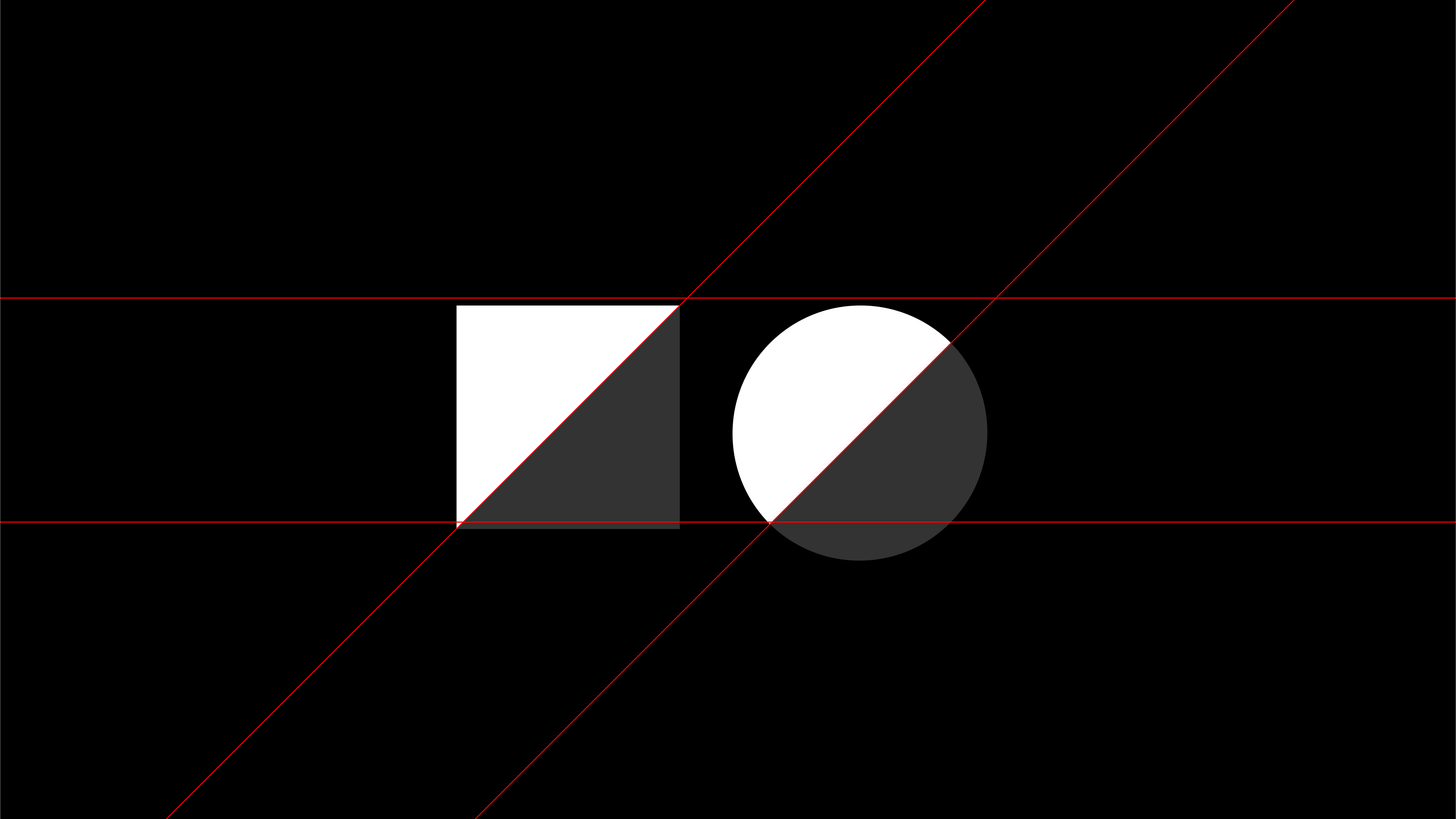
Moho's design language is rooted in simplicity, beginning with the fundamental forms of the square and circle. As light interacts with these shapes, they evolve—subtly carved and refined by its presence. This concept serves as the foundation for the brand’s visual identity, creating a dynamic yet cohesive system.
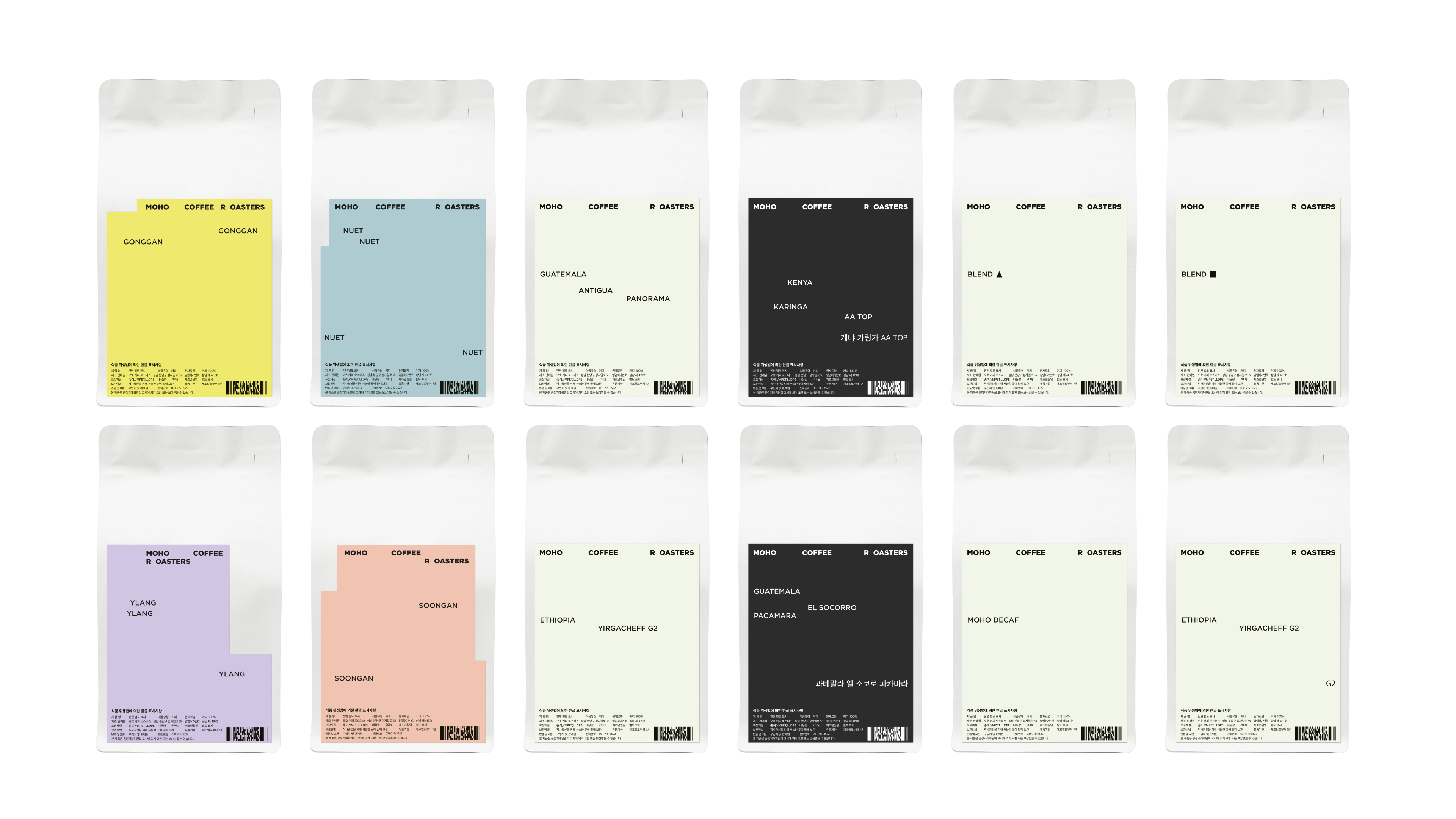
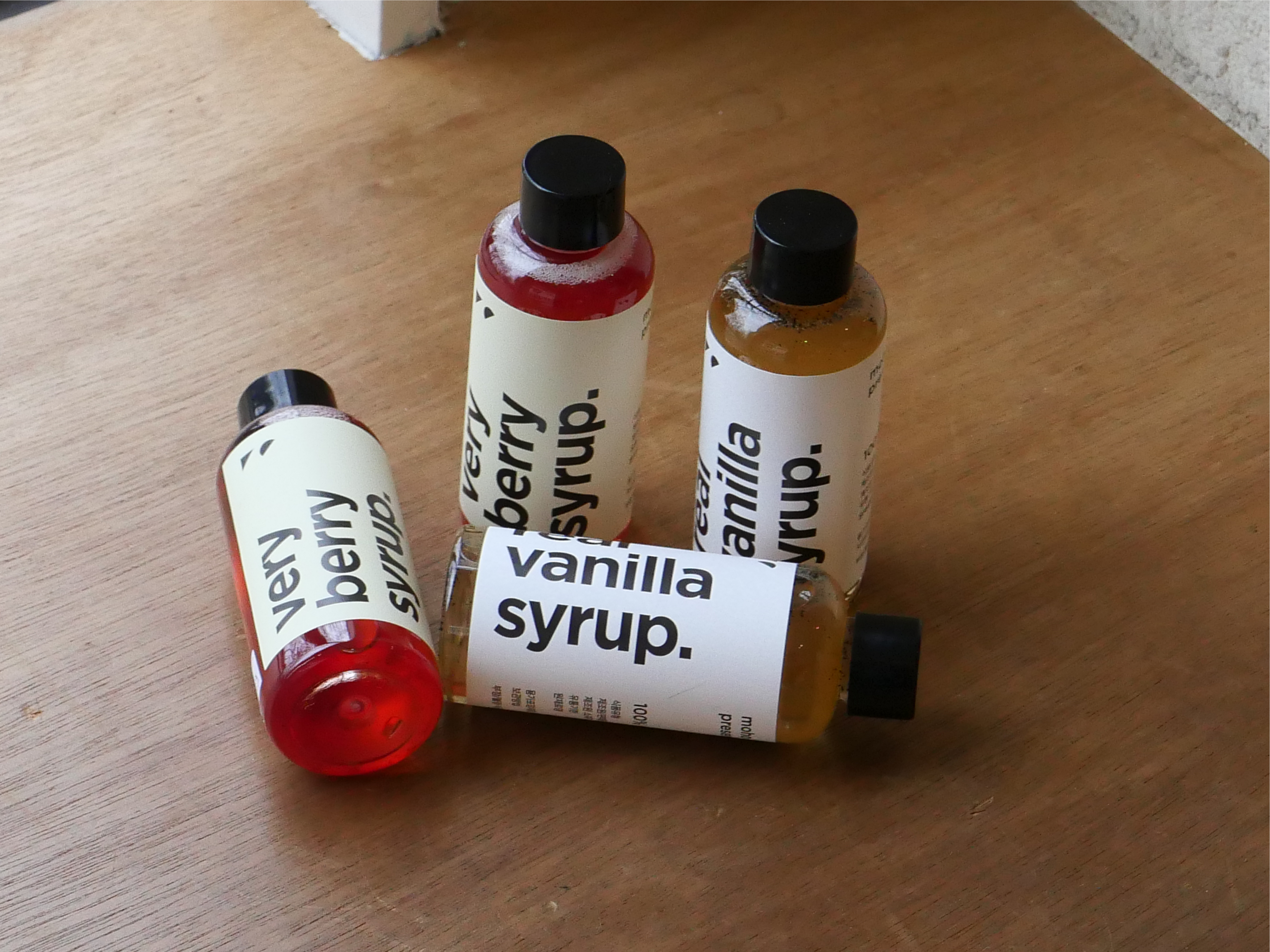
Since its inception, I have led Moho’s art direction, shaping its brand identity, packaging, and various design applications. The core geometric elements extend across all touchpoints, functioning as versatile assets that unify the brand while allowing for creative expression. The result is a design that feels both minimal and organic, capturing the essence of Moho’s philosophy through intentional forms and thoughtful execution.
Since its inception, I have led Moho’s art direction, shaping its brand identity, packaging, and various design applications. The core geometric elements extend across all touchpoints, functioning as versatile assets that unify the brand while allowing for creative expression. The result is a design that feels both minimal and organic, capturing the essence of Moho’s philosophy through intentional forms and thoughtful execution.
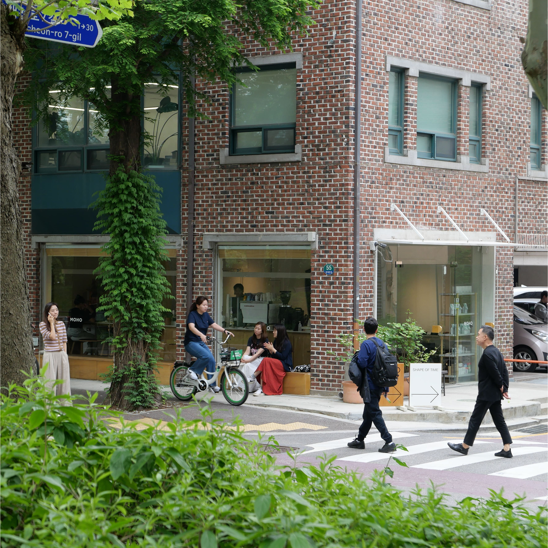
Moho is a specialty coffee brand that prioritizes emotion over information and empathy over knowledge. Rooted in direct-fire roasting, Moho employs a unique roasting method that combines the advantages of both direct-fire and convection roasting through a specially designed exhaust system. This technique enhances the clarity, depth, and complexity of flavors in every cup. The brand roasts 15 to 20 varieties of specialty coffee beans from different origins, along with three signature blends exclusive to Moho. Nestled by Yangjaecheon in Seoul, Moho also serves as a tranquil local community hub.
Logo Grid System
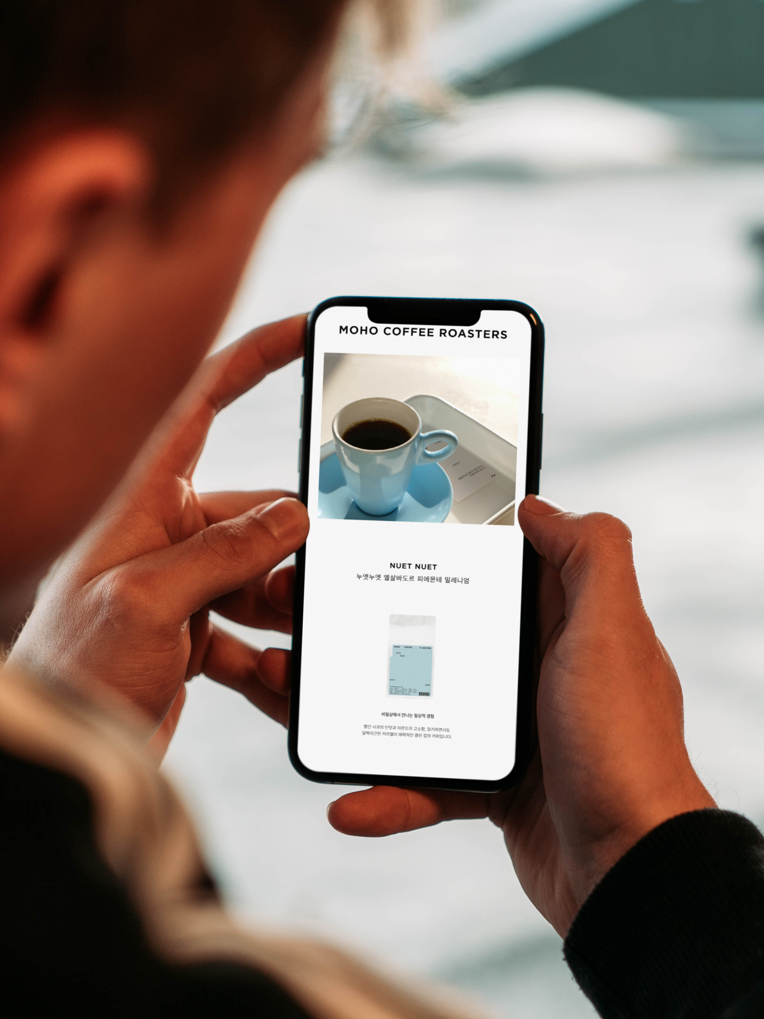
Social Media Application
![]()


Irregular Shpaes Applied to the Wall Installation
